Heat waves across the nation this summer have been intense. And in some states, that's an understatement.
Texas is no stranger to extreme weather or an energy crisis. Just two winters ago (2021), a historic cold snap cost the state at least $195 Billion1 and claimed 246 lives2. This summer, temperatures have been soaring well past 100 and a new record for highest-ever daily electric usage was set3.
The duration of a heat wave is usually more taxing than any individual day. The hottest temperatures may be what makes the headlines, but public safety and energy officials must dive deeper into the data to make critical operational planning and response decisions.
This is where a proprietary weather API with customizable data can help. And when you use a software tool like ArcGIS, the real story behind the numbers comes to life.
Emily Dobbs is a Meteorologist and GIS Analyst for Baron Weather. She says relying solely on commodity weather data, such as official reporting stations, increases your risk for error.
"Reporting stations may not be properly calibrated, they can malfunction, and you're limited to only receiving data at those specific points," she adds.
A higher resolution dataset, such as the one Emily prefers, uses a denser collection of points to derive information more representative of where an asset is located. She trusts this method to be "more accurate" at deriving numbers for precise locations over large periods of time.
Analyzing the Heat Wave with Better Weather Data
Extreme temperatures can take their toll on energy supply, especially when the number of days under stress continues to climb. The need for resources doesn't always match the exact pattern of temperatures. Other factors such as population density, wind, and humidity can also play a role.
The animation below uses high resolution historical temperature data to analyze which substations have endured the most intense heat through June and July.
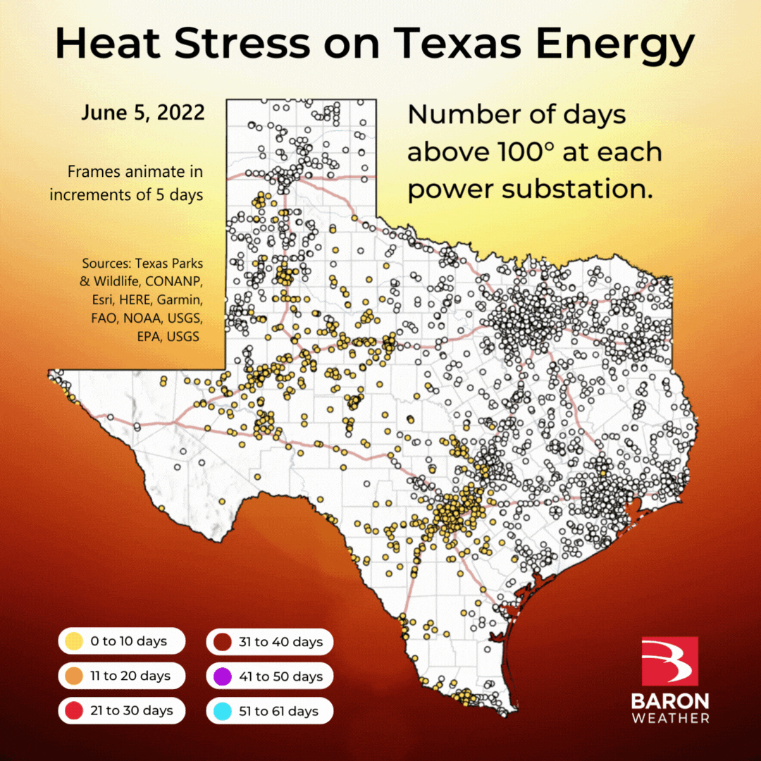
Substations near the urban corridor along I-35 from San Antonio to Dallas have taken the brunt of this summer's heat. Of the 3,611 stations analyzed in this study, 261 of them (shaded in light blue) have had a daily maximum temperature above 100° more than 51 times in June and July.
The data used in this example is derived from a collection of reporting stations and blended by high-resolution modeling to tell the story of heat intensity over time.
Baron's High-Resolution Surface Temperature product utilizes a unique combination of observed temperatures and model data. National Weather Service official reporting stations are limited to only specific locations, so credible short-term model data is used to fill gaps where observations are not available. The blended dataset is comprised of thousands of points deriving temperature every five minutes at every 3 kilometers. These points are then rasterized into square pixels at 3km x 3km. This results in a seamless image that can be easily queried by GIS software to identify temperature at a specific location.
The Baron Weather API delivers both historical and predictive datasets that can help assess the impacts a heat wave can cause on an energy grid. Developers can request a free trial with code examples to test in their GIS or web application platform with ease using our API documentation.

1 2021-Winter-Storm-Uri-AAR-Findings-Report.pdf (austintexas.gov)
2 Texas winter storm official death toll now put at 246 | The Texas Tribune
3 As a heat wave blankets much of the U.S., utilities are managing to keep up, for now | WBUR
